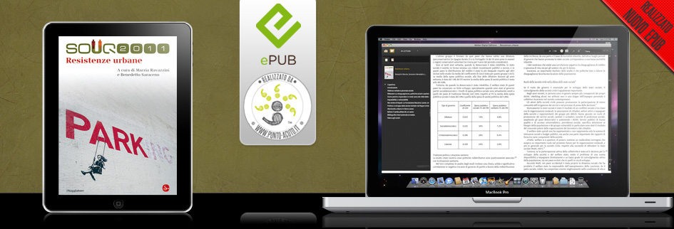
Punto Acuto ha realizzato l’eBook in formato ePub di “SOUQ 2011 – Resistenze urbane” edito il Saggiatore, a cura di Marzia Ravazzini e Benedetto Saraceno.
Il volume presenta al suo interno immagini e tabelle. Nel dettaglio possiamo notare che le tabelle hanno la particolarità di avere un font (sans-serif o bastoni) differente rispetto a quello del testo (serif o con grazie) e questa distinzione, utile per il lettore, è stata mantenuta anche nella versione ePub. (guarda immagine in basso)
Punto Acuto has created the eBooks in ePub format of “Souq 2011 – Urban Elements” published il Saggiatore, edited by Marzia Ravazzini and Benedetto Saraceno.
The book features images and tables inside. In detail, we note that the tables have the distinction of having a font (sans-serif) different from that of the(serif) and this distinction is useful for the reader, was maintained in the ePub version. (see image below)
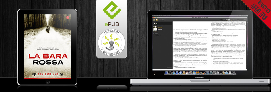
Punto Acuto ha realizzato l’eBook in formato ePub de “La bara rossa” edito il Saggiatore, di Sam Eastland.
Questo titolo non fa parte della collana – molto complessa nella realizzazione – che solitamente Punto Acuto lavora per il Saggiatore, la Cultura, ma si tratta di una Narrativa. Quindi apparentemente la struttura di questo libro può sembrare molto semplice ma analizzandolo nel dettaglio si più notare che è un testo ricco di particolarità.
Infatti, oltre a rispettare la divisione in numerosi capitoli – soprattutto per evitare che ogni singolo file raggiunga una pesantezza eccessiva che ne rallenterebbe la visualizzazione -, si sono mantenute anche le note a piè di pagina, i maiuscoletti e gli infratesti. (guarda immagine in basso) Link alla scheda del libro sul sito il Saggiatore.
La bara rossa di Sam Eastland – il Saggiatore – dettaglio ePub
La bara rossa di Sam Eastland pdf italiano da Google Books
Punto Acuto created the eBooks in ePub of La bara rossa published il Saggiatore, by Sam Eastland.
This title is not part of the series – very complex in execution – that usually works for the Acute Point Basic Books, Culture, but it is a fiction. So apparently the structure of this book may seem very simple but analyzing it in more detail we note that it is a text full of peculiarities.
In fact, in addition to respecting the division into several chapters – mainly to avoid any excessive heaviness reaches a single file that would slow down the display – which have also kept the notes in the footer, small capitals and infratesti. (see image below) Link to details on the website of the book The Assayer.
La bara rossa by Sam Eastland – il Saggiatore
La bara rossa by Sam Eastland pdf italiano from Google Books
Punto Acuto ha realizzato l’ePub di Terza cultura, della casa editrice il Saggiatore. Il libro, curato da Nicla Vassallo e Vittorio Lingiardi, verrà presentato domenica 30 ottobre al Festival della scienza di Genova.
La terza cultura è una comunità internazionale di scienziati e filosofi, artisti e scrittori, impegnati in un dialogo creativo-costruttivo che si pone come obiettivo la promozione di nuove teorie e pratiche umane.
Sollecitati dalla domanda «Da quale prospettiva guarda la terza cultura, e quale terza cultura in Italia?», più di ottanta autori ricostruiscono, in brevi, incisivi interventi, sforzi, frustrazioni, innovazioni, progetti, tensioni della ricerca.
Punto Acuto created the eBooks in ePub of Terza cultura, by il Saggiatore. The book, edited by Nicla Vassallo and Vittorio Lingiardi, will be presented Sunday, Oct. 30 at Science Festival of Genoa.
The third culture is an international community of scientists and philosophers, artists and writers engaged in a creative and constructive dialogue that has as its objective the promotion of new theories and human practices.
Prompted by the question «From what perspective view third culture, and as a third culture in Italy?», more than eighty authors reconstruct, in short, incisive interventions, stress, frustrations, innovations, projects, research tensions.
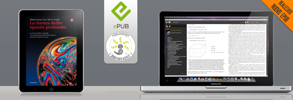
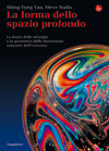
Punto Acuto ha realizzato l’eBook in formato ePub de “La forma dello spazio profondo” edito il Saggiatore, di Shing-Tung Yau e Steve Nadis.
Questo libro è ricco di immagini, formule matematiche e simboli.
Punto Acuto ha cercato di preservare il più possibile la struttura del libro cartaceo rendendolo ancora più comodo e fruibile nel formato eBook. Spesso infatti le formule matematiche vengo trasformate in immagini, per non perdere tempo o perché non si conosce il modo di trattarle. Questo rende initulizzabile la funzione di ricerca dell’ePub per i simboli, caratteri speciali o formule (il testo contenuto nelle immagini non è selezionabile e quindi non viene inteso come testo dal programma di lettura). Sono stati quindi mantenuti tutti i simboli matematici e reinseriti con un apposito font quelli greci (come si può vedere dallo screenshot qui sotto).
La forma dello spazio profondo – il Saggiatore – formule matematiche
Inoltre sono state preparate tutte le immagini in modo da poter essere visualizzate correttamente sui supporti più diffusi. Infatti i lettori, come Adobe Digital Edition®, non effettuano il ridimensionamento delle immagini e visualizzando per esempio il file con due pagine affiancate le immagini vengono sovrapposte.
Come si può vedere nelle immagini postate, nell’eBook l’immagine si ridimensiona e non invade il testo della pagina vicina.
La forma dello spazio profondo – il Saggiatore – Immagini
Punto Acuto has created the eBooks in ePub format from “La forma dello spazio profondo” published il Saggiatore, Shing-Tung Yau and Steve Nadis.
This book is rich with images, mathematical formulas and symbols.
Acute Point has tried to preserve as much as possible the structure of a book and making it even more convenient and available in eBook format. Often, mathematical formulas come into pictures, to save time or because you do not know how to treat them. This makes the search function initulizzabile dell’ePub for symbols, formulas, or special characters (the text contained in images is not selectable and therefore is not intended as a text by the reader). They were then kept all the mathematical symbols and reinserted with a special font Greek ones (as you can see from the screenshot below).
La forma dello spazio profondo – il Saggiatore – mathematical formulas
Were also prepared all the images so that they can be displayed properly on the popular media. In fact, the readers, such as Adobe Digital Editions ®, do not perform image resizing and viewing the file, for example, with two facing pages, the images are superimposed.
As you can see in the pictures posted, in the eBook you resize the image and text on the page does not invade nearby.
La forma dello spazio profondo – il Saggiatore – Images
Punto Acuto ha realizzato l’eBook in formato ePub di “Voltando pagina” edito il Saggiatore, raccolta di saggi di Virgina Woolf curata da Liliana Rampello.
Dal punto di vista della lavorazione dell’eBook, oltre a preservare tutta la formattazione dell’opera, si è data particolare importanza alla table of contents (toc), cioè il sommario, molto complesso che si sviluppa in ben quattro livelli.
Inoltre alcuni saggi contengono delle citazioni in greco; generalmente nella conversione dei file i simboli non standard vengono persi e non è possibile visualizzarli sui lettori e-reader correttamente. Punto Acuto ha fatto in modo di mantenere l’esatta visualizzazione dei caratteri per mostrare su vari e-reader le citazioni in greco correttamente (come si può vedere dallo screenshot qui sotto).
iPhone: Voltando pagina di Virginia Woolf – il Saggiatore – Citazioni greco
Voltando pagina di Virginia Woolf pdf italiano da Google Books
Punto acuto has created the eBooks in ePub format “Voltando pagina” published il Saggiatore, a collection of essays by Virginia Woolf edited by Liliana Rampello.
From the point of view of processing eBook, in addition to preserve all the formatting of the work, has been given special importance to the table of contents (toc), very complex which develops in four levels.
Also some of the essays contain quotes in greek , usually in the conversion of non-standard files the symbols are lost and can not be viewed properly on readers e-reader. Acute Point has made sure to keep an exact character display to show on various e-readers the quotes in greek correctly (as you can see from the screenshot below) . Link alla scheda del libro sul sito il Saggiatore.
iPhone: Voltando pagina by Virginia Woolf – il Saggiatore – the quotes in greek
Voltando pagina Virginia Woolf pdf italiano by Google Books
Quante volte vi è capitato di acquistare o commissionare un ebook per poi trovarvi a sfogliare un libro pieno di lacune? Mi spiego meglio: avete mai fatto caso a quanti maiuscoletti e corsivi fanno perdere le loro tracce? Per non parlare della parole o lettere saltate nei sommari, ai collegamenti errati, ai numeri di pagina campati qua e là nel flusso del testo… Bene, se ora la paranoia si è impadronita di voi, siete pronti per leggere il resto del post.
Questi refusi non verrebbero mai accettati in un libro cartaceo e non fuggirebbero a un’attenta correzione di bozze… ma purtroppo nell’ebook capitano non di rado (parlo sia per i lettori che per gli editori).
Partendo dalla conversione di un pdf in ePub, un pdf non editabile per la precisione, cercherò di dimostrarvi cosa si può riuscire a ottenere e soprattutto a quali risultati dire “no grazie”.
Per far questo è stato utilizzato come file di partenza un testo presente su The Internet Archive. [spoiler]La mission di questa biblioteca digitale è quello di offrire “un accesso universale alla conoscenza” e grazie allo strepitoso lavoro fatto possono essere fruiti un gran numero di capolavori. Dico questo perché non è mia intenzione affermare che il loro lavoro è stato fatto male, anzi: la loro è un’organizzazione no-profit che ci dà la possibilità di accedere da ogni postazione in giro per il globo al loro immenso archivio. Quindi se i file che mettono a disposizione non sono impeccabili poco male, quello che conta è il loro fine. Ma gli errori riscontrati nel loro file sono quelli più comuni che ci sono anche in ebook acquistati…[/spoiler]
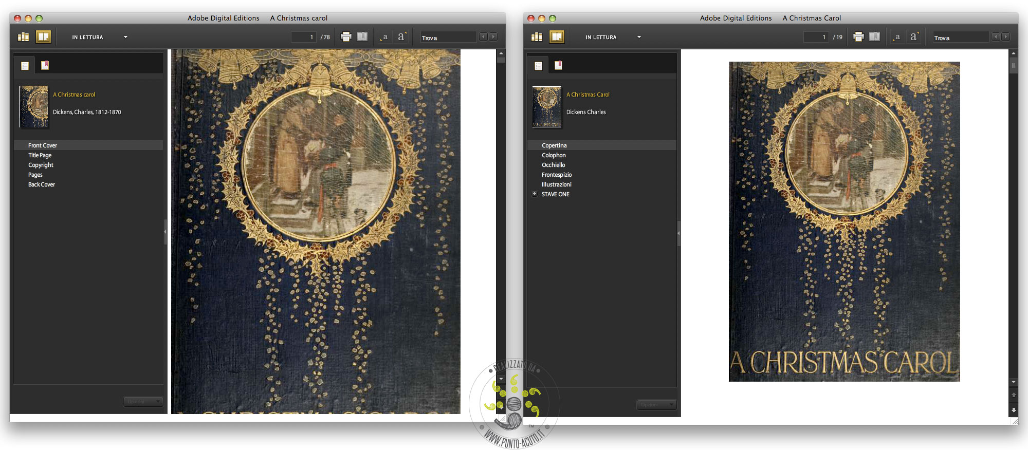
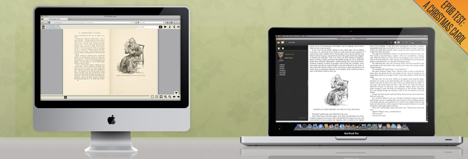
Il pdf di partenza per esemplificare il lavoro è quello di A Christmas Carol (disponibile per la visione o il download gratuito).
Nelle immagini che seguono potete vedere sulla sinistra la schermata, in Adobe Digital Editions, dell’epub realizzato da The Internet Archive; a destra l’ePub realizzato da Punto-acuto.
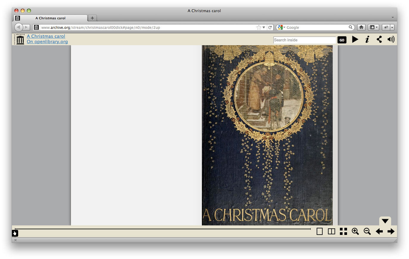
COPERTINA
L’immagine della copertina non è stata trattata correttamente. Questo significa che la miniatura presente nell’ePub in alto a sinistra è solo parte della copertina e anche nell’immagine visualizzata dal programma dove poi scorrerà il testo, la copertina è tagliata e non visualizzata per intero. Ma con un piccolo accorgimento ecco che si può facilmente risolvere (immagine a destra).
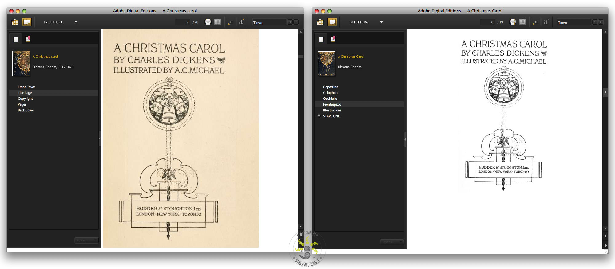
FRONTESPIZIO
In questo caso l’immagine del frontespizio è stata lasciata tale a quale a quella uscita dalla scansione (con il colore seppia della carta). Nella visualizzazione in epub però non ha senso mantenere quel colore, soprattutto pensando a uno schermo e-ink (come quello del Kindle e del Sony). Anche in questo caso è sufficiente un’ottimizzazione dell’immagine per garantire una piena leggibilità dei contenuti.
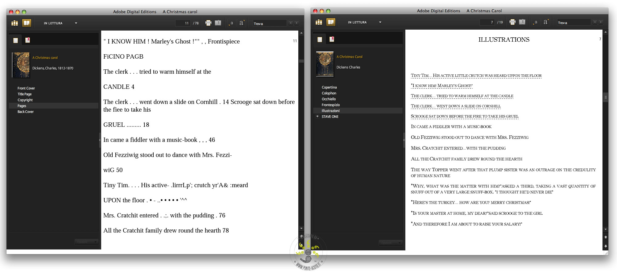
RIEPILOGO ILLUSTRAZIONI
Nel caso dell’indice delle figure, sono stati commessi, oltre ad alcuni classici errori da OCR, anche errori come la mancata conservazione delle formattazioni (per esempio di maiuscoletti e corsivi) e soprattutto non è stata sfruttata l’interattività dell’epub inserendo i link diretti alle immagini. Un ulteriore accorgimento (immagine di destra) per rendere ancor più piacevole la lettura è l’utilizzo di un font particolare come quello che ho utilizzato.
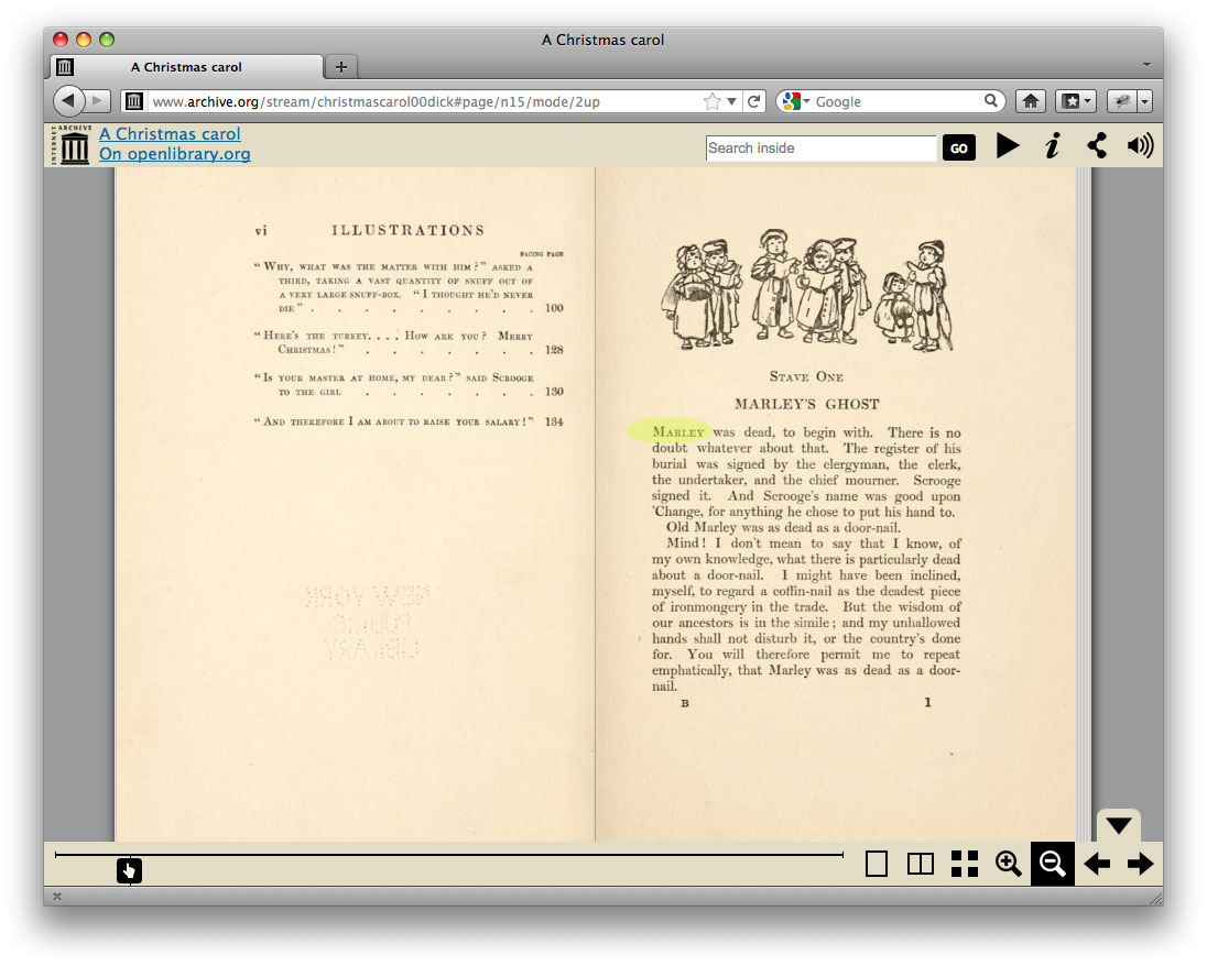
CAPITOLO
In queste immagini ho simulato il gioco delle differenze: in verde potete vedere le differenze più evidenti tra le due versioni. Oltre al font e al colore dell’immagine, ho mantenuto la formattazione e cancellato le testatine erroneamente mantenute dall’OCR.
[singlepic id=1 w=540 float=none]
FORMATTAZIONE DEL TESTO
[singlepic id=12 w=540 float=none]
Un piccolo tocco di stile: spesso gli stili degli infratesti vengono annientati e non si capisce più la differenza tra paragrafo e infratesto… e la lettura si fa faticosa. Ma ecco che basta un’attenzione in più e il testo riprende la forma originaria.
[singlepic id=11 w=540 float=none]
ESEMPIO IMMAGINI
[singlepic id=15 w=540 float=none]
Uno dei punti a favore dell’ebook rispetto al cartaceo è la presenza dello strumento “cerca”. Ma se il testo viene inglobato in un’immagine, come nel caso della fotografia in basso a sinistra, le nostre ricerche saranno infruttuose. Ed ecco che trattando la didascalia come testo esportandola dall’immagine si ovvia il problema. Poi un intervento per un bordo più leggero e coerente all’immagine e anche l’occhio è accontentato.
[singlepic id=17 w=540 float=none]
Le immagini, se trattate correttamente, rappresentano un grande valore aggiunto in un libro. Ma se vengono mortificate e visualizzate in malo modo si snaturano e rischiano anche di diventare un peso (sia un termini di Kilo/Megabyte che di fastidio). Una ripulita e una ripensata per il nuovo formato possono restituirgli la “dignità perduta”.
[singlepic id=13 w=540 float=none]
EPUB VALIDO
Last but not least… L’epub deve essere validato per non generare problemi di lettura nei vari ereader. Ed è proprio questa la prova del nove per un ePub: dimostrare che il castello di carte (digitali) regga. E indovinate un po’ l’esito dell’ePub realizzato da Punto-acuto? 🙂
ePub ValidHow many times did you purchase or order an ebook and then find yourself leafing through a book full of gaps? Let me explain: Have you ever noticed how many small caps and italics are losing their tracks? Not to mention the words or letters in the jump summaries, links to incorrect page numbers campati here and there in the text flow… Well, if now the paranoia has taken hold of you, you are ready to read the rest of the post.
These typos would never be accepted in a paper book, not to flee careful proofreading… but unfortunately not uncommon in the eBook captain (I speak for both readers for publishers).
Starting from converting a PDF to ePub, a non-editable pdf to be precise, I will show you what you may be able to obtain such results, and especially to say “no thanks”.
[spoiler show=”more” hide=”less”]The mission of this digital library is to provide “universal access to knowledge,” and thanks to the tremendous work done can be enjoyed a multitude of masterpieces. I say this because my intention is not to say that their work has been done wrong, or rather: their is a nonprofit organization that gives us the ability to access from any location around the globe with their huge archive. So if the files they make available are not flawless little bad, what matters is their end. But the errors found in their ranks are the most common ones that are purchased in ebook…[/spoiler]
The pdf of departure to illustrate the work is to A Christmas Carol (available for view or download free ).
In the following pictures you can see on the left of the screen in Adobe Digital Editions , dell’epub realized by the Internet Archive; on the right ePub made by point-sharp.
COVER
[singlepic id=16 w=540 float=none]
The cover image was not treated properly. This means that the thumbnail in the top left nell’ePub is only part of the cover and also the image displayed by the program where they will flow the text, the cover is cut and not fully displayed. But with a little trick here is that you can easily solve (see right).
[singlepic id=2 w=540 float=none]
TITLE PAGE
[singlepic id=15 w=540 float=none]
In this case the image of the cover page that has been left to which that output from the scan (with the sepia color of the card). In the display ePub though it makes no sense to keep that color, especially thinking about an e-ink screen (like the Kindle and Sony). Even in this case just a ‘image optimization to ensure full clarity of content.
[singlepic id=3 w=540 float=none]
SUMMARY ILLUSTRATION
[singlepic id=5 w=540 float=none]
In the case of index figures have been committed, as well as some classics by OCR errors, including errors such as failure to preserve the formatting (for example small caps and italics) and above was not exploited the ‘interactivity dell’epub entering direct links to images . A further caveat (right image), making it even more enjoyable to read is to use a particular font as what I used.
[singlepic id=6 w=540 float=none]
CHAPTER
[singlepic id=4 w=540 float=none]
In these images, I simulated the game of the differences in green you can see the most obvious differences between the two versions. In addition to the font and color of the image, I kept the formatting and headers mistakenly deleted the OCR maintained.
[singlepic id=1 w=540 float=none]
FORMATTING TEXT
[singlepic id=12 w=540 float=none]
A little touch of style: infratesti styles often are destroyed and no longer understands the difference between paragraph and sub-text … and reading becomes difficult. But that’s just extra attention and the text resumes its original shape.
[singlepic id=11 w=540 float=none]
SAMPLE IMAGES
[singlepic id=15 w=540 float=none]
One of the points for the ebook than the paper is the presence of tool “search”. But if the text is embedded in an image, as in the case of the photograph in the lower left, our research will be fruitless. And then dealing with the caption as text from the image by exporting the problem is obvious. Then an intervention for a lighter board and consistent image and the eye is satisfied.
[singlepic id=17 w=540 float=none]
The images, if treated properly, are a big plus in a book. But if you are mortified and appear badly distort it and also risk becoming a burden (both terms of a kilo / Megabytes than annoyance). Cleaned up and redesigned for the new format can restore the “lost dignity.”
[singlepic id=13 w=540 float=none]
EPUB VALID
Last but not least… The ePub should be valid for not generate problems reading the various e-readers. And this is the litmus test for ePub: prove that the house of cards (digital) hold. And guess what ‘the outcome dell’ePub realized by point-acute? 🙂
Per ISBN Edizioni è stato realizzato l’eBook in formato ePub del libro: Retromania di Simon Reynolds.
Punto Acuto sul Colophon di Retromania – iPad
Questo epub è stato realizzato mantenendo il più possibile l’impaginazione del libro stampato adattandola alle caratteristiche del formato epub. In questo modo, per esempio, sono stati mantenuti e ottimizzati strutturalmente i focus di approfondimento anche con l’utilizzo di un font differente rispetto a quello utilizzato nel resto del testo. Grazie a questa formattazione ad hoc è stata mantenuta la particolarità del libro e la sua resa estetica.
Struttura Retromania su iPhone
Sono stati inseriti i link delle note, dei collegamenti ipertestuali esterni ed è stata mantenuta tutta la formattazione del testo originale inclusi i maiuscoletti.
For ISBN Edizioni has been created the eBooks in ePub format of the book: Retromania by Simon Reynolds.
Punto Acuto Colophon in Retromania – iPad
This epub was made to hold on as much as possible the layout of the printed book, adapting to the characteristics of the ePub format. In this way, for example, box “focus on” have been kept and structurally optimized. Box has a different font compared to that used in the rest of the text. With this ad-hoc formatting has been kept the peculiarities of the book and its aesthetic.
Structure of Retromania on iPhone
Were inserted link notes, hyperlinks and has been kept outside all the formatting of the original text, included small capitals.
 Punto Acuto ha realizzato l’eBook in formato ePub di “SOUQ 2011 – Resistenze urbane” edito il Saggiatore, a cura di Marzia Ravazzini e Benedetto Saraceno.
 Punto Acuto ha realizzato l’eBook in formato ePub de “La bara rossa” edito il Saggiatore, di Sam Eastland.
 Punto Acuto ha realizzato l’eBook in formato ePub de “La forma dello spazio profondo” edito il Saggiatore, di Shing-Tung Yau e Steve Nadis.


 Punto Acuto ha realizzato l’eBook in formato ePub di “Voltando pagina” edito il Saggiatore, raccolta di saggi di Virgina Woolf curata da Liliana Rampello.
 Quante volte vi è capitato di acquistare o commissionare un ebook per poi trovarvi a sfogliare un libro pieno di lacune? Mi spiego meglio: avete mai fatto caso a quanti maiuscoletti e corsivi fanno perdere le loro tracce? Per non parlare della parole o lettere saltate nei sommari, ai collegamenti errati, ai numeri di pagina campati qua e là nel flusso del testo… Bene, se ora la paranoia si è impadronita di voi, siete pronti per leggere il resto del post.